
The Monkey Chart Manifesto
© 2025 by Tony Fabris
I'm a rhythm guitarist, and I hate how rhythm guitar parts are charted.
All the standard charting methods suck. Chords above lyrics? Terrible, I don't get any sense of the chord patterns, rhythmic patterns, or how many beats each chord is played. Lead sheets? Confusing to me, and a huge waste of space for a rhythm guitarist just playing chords. Sheet music or tablature? I can't read them fast enough, and they still waste a ton of space. Slash notation and fake books, where repeated chords are indicated by dashes and slashes? Very confusing, and too easy to lose my place in the song. Nashville numbers? Almost useful, but they require an extra mental translation step, and they don't include lyrics.
To solve this problem, I have created THE MONKEY CHART. So named because any monkey can play the song if they have the chart. It is, for me, the only way to pull any old song out of my songbook and perform it accurately, with all the nuances, and with minimal rehearsal. It's better than any other kind of chart that I've seen. It can even be useful for other band members: Our cellist and violinist use these as the basis for their own charts, and our lead singer cribs off the same chart that I do.
The Monkey Chart is my gold standard for rhythm guitar notation. It takes some care and effort to prepare one, but it's the most readable and least stressful way for me to sight-read during a performance.
Monkey Charts are great for:
- Songs I know, but haven't memorized.
- Structured, standard-form songs with basic chords and few surprises, such as folk, rock, pop, etc.
- Printing on US-Letter size paper, or displaying on a tablet screen. I recommend a large 13"-15" tablet.
- Recording sessions or live performances with minimal rehearsal, if I don't mind being seen reading off a chart.
- Using as a guide that I can scan from a distance, without having to keep my eyes completely glued to it.
Monkey Charts aren't for:
- Songs I've never heard or played before.
- Classical music, complex pieces, or detailed melody notation.
- Songs I don't have the chords for yet.
- Songs where most of the chords are complex and/or I'm going to need all the chords diagrammed.
These charts are something I've gradually developed and perfected over the last 20 years. I doubt I'm the only person to ever come up with this; surely someone else must have invented this system in parallel. It's too useful and obvious to be unique. But I've never seen anyone else using anything like this. The only Monkey Charts I've seen "in the wild" are from my own bandmates, or other acquaintances who adopted the style from me. I'd like to change that.
So below, in excruciating detail, I describe how I make them.
Examples
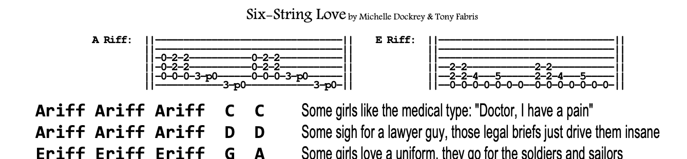
Here are links to some example charts for Vixy & Tony songs. You might find them strange at first, but after seeing them, I hope you'll agree that they're clearer than other standard charting formats.
| Emerald Green | Thirteen |
| The River | Strange Messenger |
| We Can Be Anything | Apprentice |
| We Are Who We Are | Burn it Down |
Features
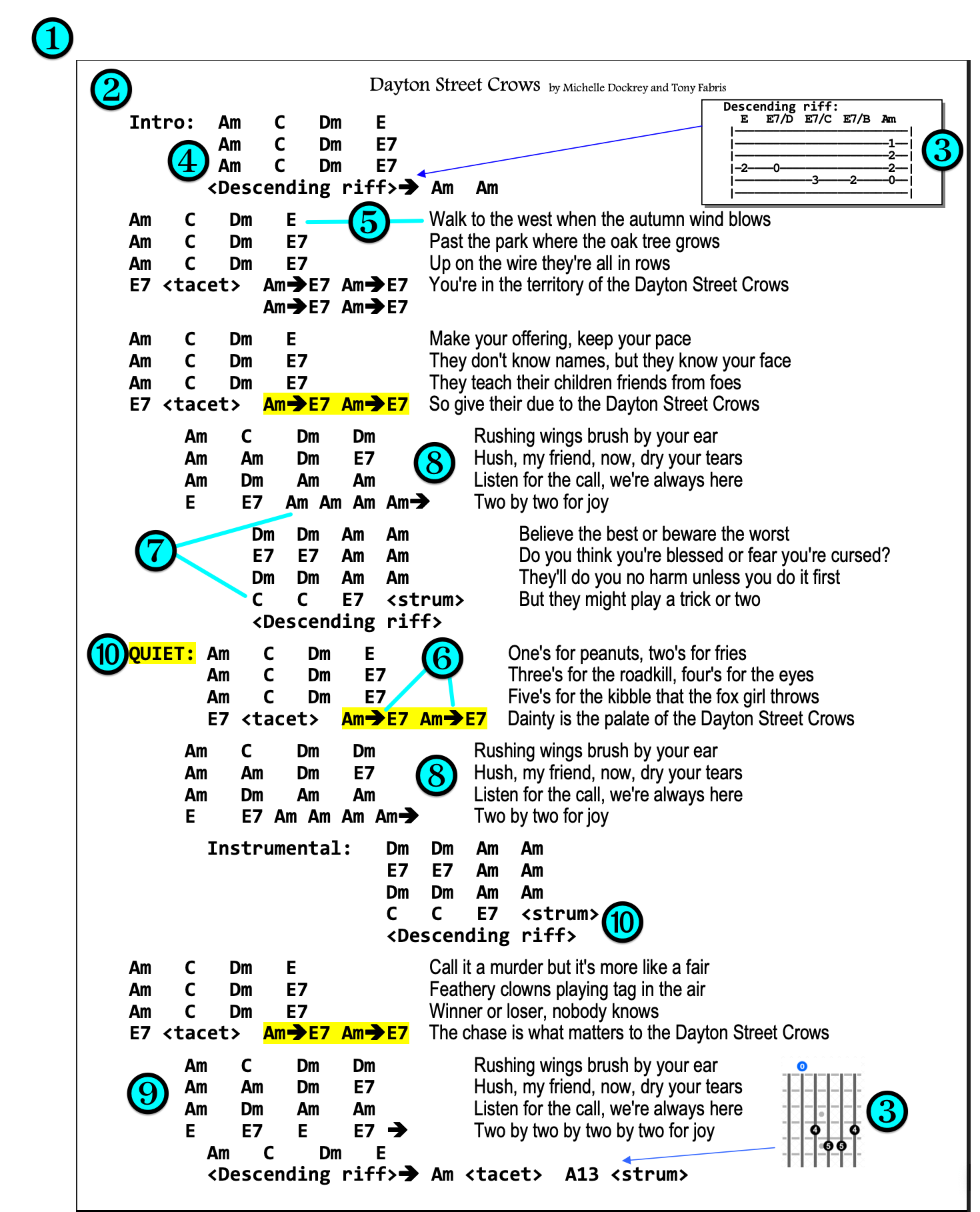
❶ Most songs will fit on one US-Letter sized page. Long or complex songs might need two pages.
❷ All chords and lyrics appear together on the page in a large, readable font.
❸ Only uncommon chords or special riffs are diagrammed; most of the chart is simply chord names.
❹ Chord patterns and structures are clearly visible.
❺ Each line of lyrics corresponds to a line of chords.
❻ Every chord symbol on the chart represents the same number of beats, unless specially notated.
❼ Repeated chords are simply listed again, no confusing slashes or dashes.
❽ Repeated sections such as choruses are fully written out, to prevent losing your place in the song.
❾ Song structure (verse/chorus/bridge/etc.) is clearly visible thanks to indentation.
➓ Special notes, for dynamics and special cases, are clearly visible.
Creating a Monkey Chart
Start with the correct chords and lyrics
I make sure that I start with an accurate set of chords for the song, and an accurate set of lyrics: no mondegreens allowed. Unless I wrote the song myself, finding accurate source material can be surprisingly tough, since googling for chords and lyrics turns up a plethora of amateur transcriptions, riddled with mistakes and oversimplifications. I could write a whole manifesto on that topic, but that would be a different manifesto; this one is about making a readable chart from good chords and lyrics.
Use a text editor program, turn off Word Wrap
I start in a plain-text code editor, such as Notepad++ on Windows, or Sublime Text on Macintosh. Later, I'll transfer the text to a full-fledged word processor for final formatting, but the initial editing is easiest in a code editor.
Why use a plain-text code editor?
- They default to a monospaced font, so I can use spaces to line up the chords into neat, readable patterns of rows and columns.
- They let me turn off Word Wrap, so each line can be as long as it needs to be. This gives me full control over line endings, and I can clearly see every carriage return in the document. Turning off Word Wrap is very important during the initial edit.
- Plain-text editors have a column-select mode (hold the ALT key while drag-selecting) which lets me copy and paste columns of text instead of lines. This is very helpful for marrying the chords to the lyrics.
Only one line for title and author
I standardize on having the first line of the document be (Song Title) by (Author Name), all on one line. This wastes as little space as possible, leaving more room for the chords and lyrics on the page.
Chords to the left
Next, I paste or type the lyrics and chords into the document, relying heavily on the editor's column-select mode. I might be preparing the lyrics in one file and the chords in another, then pasting them together into a third file, using the ALT-select to get them lined up.
I put the chords to the left of each corresponding lyric line. Each line contains the chords for that line of the song, then a few spaces, followed by that line of the lyrics, followed by a carriage return. I line up the chords into neat columns so that the pattern of chord changes is clearly visible. I tend to use 2-3 spaces between each of the chords, and 3+ spaces between the chords and the lyrics, with the lyric lines lining up vertically, left-justified.
G   G   D  D    Do you believe in a world
C9  C9  G  G    Where every person has a place
G   G   D  D    Where everyone can find their story
C9  C9  G  G    And see a reflection of their own face
Putting the chords to the left of the lyrics, instead of above them, might seem unusual at first. But it turns out that this is the most useful way to marry the two. Advantages:
- Clean and simple visual layout: Chords and lyrics are in neat, concise blocks instead of scattered or ragged.
- Chords and lyrics are visually separated while still being connected. I can read the chords without getting distracted by the lyrics, and vice versa, while still seeing clearly which lyric line matches which chord line.
- I can easily see patterns in the chord progression, and so can the lead singer if they need to. Sometimes this can be very helpful for the lead singer.
- If I'm the one singing, my eye still picks up the first couple of words of the lyric line while I'm looking at the chords, which is usually all I need to remember the lyric.
Line breaks
For every song, I need to make a judgment call as to what constitutes a "line", and where I choose the cutoff point for the next line. I try to strike the correct balance between line length (horizontal) and number of lines (vertical) to make the chart fit on a page nicely, while still having the pattern of lyric lines make sense. If I break it up into too many lines, the chart won't fit on one page. If I combine too much text into a single line, then, when the document gets formatted, the line will go past the right margin and wrap around, ruining readability. My goal is to make the layout as simple and logical as possible, and useful both for singing and for playing, while still fitting neatly on a letter-sized page.
Example:
Am  Am  G  G    The legend of the firebird is one of transformation
Em  Em  Am Em   If you dare to take the journey, and you give the wolf his due
Example:
Am  Am   The legend of the firebird
G   G    Is one of transformation
Em  Em   If you dare to take the journey
Am  Em   And you give the wolf his due
Both examples work, but the second example is not as efficient with its use of space. Notice how it takes four lines to accomplish what the first example does in two lines. Arranged that way, the song takes up more vertical space. The first example is wider, so it might exceed the right margin and make the line wrap around, while the second example might cause the song to stretch to two pages, so it's a tradeoff that I have to make.
The choice of where I break the lines can also affect how easy it is for me to see the patterns in the chord progression. To me, the first example is a clearer picture of the pattern of chords in the chord progression, it can be absorbed by my brain more quickly than the second example.
Most importantly, I want each line of chords to be logical in terms of the chord pattern. For instance, many songs will use a pattern of four chords for each line of the verses, so I'll put those four chords alongside the line of lyrics which goes with those four chords.
Spacing
Likewise, the number of spaces between the lyrics and the chords is important. They need to be close enough to see which chord line matches up with each lyric line, but far enough not to run together visually. The number of spaces will also be a tradeoff with the length of the lyric line: Too many spaces might make the line extend past the right margin and wrap around. In my case, I standardize on at least 2-3 spaces or more between the chords and the lyrics.
Timing
A word about timing: There will sometimes be cases where the lyrics don't perfectly line up with every chord line. Such as a "pickup line" where the lyric starts a little bit before the downbeat of the first chord. Or perhaps there are additional chords playing after the lyric line is done being sung. That's OK! I write the lyric line the way that seems most natural for the singer, and the chords the way that seems most natural for the guitarist. I'm not worrying about the precise timing of which syllables fall on which chords, they only need to generally line up. As a rhythm guitarist, I care about the structure and groove of the chord pattern, more than I care about which chords line up exactly with which words. The exact timing just happens, based on the feel of what we're playing and our general familiarity with the song. Examples:
Bad:
         The
Am  Am   legend of the firebird is
G   G    one of transformation, if you
Em  Em   dare to take the journey and you
Am  Em   give the wolf his due
Better:
Am  Am   The legend of the firebird
G   G    Is one of transformation
Em  Em   If you dare to take the journey
Am  Em   And you give the wolf his due
Best:
Am  Am  G  G    The legend of the firebird is one of transformation
Em  Em  Am Em   If you dare to take the journey, and you give the wolf his due
The bad example is trying to line up the first word exactly on the first chord downbeat, by putting the pickup lines on the prior line. This isn't necessary, and it makes things worse. It adds visual clutter, makes the lyrics harder to read at a glance, and causes more confusion than it's worth. For me, it's much easier to read both the chords and the lyrics if they're timed naturally for themselves. I write the chords in the most relaxed and natural pattern to play, and I write the lyrics in the most relaxed and natural pattern to sing. For most songs, they just fall into place next to each other. They might not match perfectly down to the syllable, but they generally match, in the most logical way which follows the song structure.
Neat columns
I line the chords up by using spaces, so that they fall into columns. (Most of the time. Where possible. With some exceptions.) This allows me to easily see patterns in the chord progression. Here, it's easy to see that each line of the chord progression starts with D minor to F, and then has three possible ways to finish each line. I use different numbers of spaces to compensate for longer or shorter chord names, so that they all fall in line.
  Dm  F  G   G      Thirteen
  Dm  F  Em  Em     thirteen
  Dm  F  G   G      thirteen
  Dm  F  Em  Dm     thirteen
Important note:
I never use the "columns", "tabs", or "tables" features of a word processor to put the chords and lyrics into their columns: If I used word processor columns, then the chords and lyrics would become desynchronized whenever changes were made to the document. I don't use tabs or tables because they behave unpredictably, and are difficult to work with, when editing this kind of a document. Just a monospaced font, and careful use of spaces and carriage returns, is enough.
Use indentation and vertical blanks to indicate different sections
I don't waste space on labeling "Verse:" or "Chorus:" sections. I get rid of those, and put a blank line between each section. I add a small indentation, made by typing two or more spaces, where I want to indicate a chorus, and another indentation for the bridge. I indent both the chords and the lyrics. Example:
Dm  C  Dm  C        And on the phone, out of the past, so glad he's found me now at last
Dm  C  C   Dm  Dm   And I'm afraid to go and meet him but I know my answer's yes

  Dm  Dm  Dm  C       Save me, save me, I've lost my memory
  Dm  C   Am  Am      I'm outside the world looking in
  Dm  Dm  Dm  C       Save me, save me, I'm lost in the memory
  Dm  Am  Dm  Dm      And I'd swear I'm a girl that's never been

    C  C  Dm  Dm        Just another city loner wearing sunglasses at night
    C  C  Dm  Dm        Leather jacket, purple turtleneck and blue jeans worn too tight
Number of beats per chord
I make sure each chord symbol on the chart represents the same number of beats in the song. This is the pace of the chord changes, and when I notate the song correctly, the pace and the chord patterns become clear just from looking at them. Each song has its own pace, depending on the feel and the speed of the song, so each song might have a different number of beats per chord. Most commonly, it ends up being two beats per chord, but not always.
For example, every chord in our "Girl That's Never Been" chart is two quarter-note beats per chord, which works out to two chords per measure, but our "We Can Be Anything" chart is six eighth-note beats per chord, or one chord per measure (the song is in 6/8 time). Though this differs from song to song, the number of beats per chord stays consistent within each song.
The chart usually doesn't need to say how many beats or measures there are per chord, my familiarity with the song is usually enough. I try to make the chart so that the beats and the pace just feel right for that song as I'm playing it.
This choice also governs how much space on the page that the chords occupy. The more beats each chord represents, the fewer chords I have to type, and the bigger I can make the font. But stuffing too many beats onto each chord can cause other problems, so it's a balancing act.
Repeating chords
I don't use dashes or slashes to show a chord that repeats multiple times in a row. That's a confusing notation system that I disagree with fundamentally. Also, dashes or slashes get used elsewhere in my charts to represent different things. So if the song hangs out on one chord, then I just write it down again, as many times as needed:
Dm  Dm  Dm  C       Save me, save me, I've lost my memory
Dm  C   Am  Am      I'm outside the world looking in
In that example, each chord symbol is two beats, and the song is in 4/4, so that's two measures per line. Six beats of D minor, two beats of C, two beats of D minor, two beats of C, four beats of A minor. But the beauty of this notation style is that I don't need to think about the beats and measures at all. I just follow the clear and obvious pattern and pacing of the chord changes, and it all just works.
If the song tends to repeat chords a lot, changing its chords at a slow pace, then I consider increasing the number of beats each chord symbol represents. This will free up space because fewer chords need to be written down. It's a judgment call every time, and I try to choose what's going to be the most intuitive for me. Would I rather see eight beats in this song written as G G Em Em or as G Em? That's a tradeoff between the way the song feels when I play it, how much space it occupies on the chart, and how readable and intuitive the chart feels once it's finished.
Faster chord changes
Some songs have short sections where the chords change faster than the rest of the song, such as changing once per beat instead of every two beats. I indicate those changes with arrows, telling me to switch more quickly between those chords. The arrows act as visual cues, telling me that something unusual is coming up in the chord pattern:
Am  Am  G   G      The horses' hooves on pavement make a lonely echoing sound
Am  Am  Em  Dm     I look down between the wheels and watch the slowly passing ground
F   F   F   G      While the swaying of the wagon makes me drowsy in the heat
C   C   F->G->C    I count the faded yellow lines that pass beneath my feet
In the example above, the faster chord changes are the "F->G->C" at the end of that section of the song. At first, this is using a fake ASCII representation of an arrow (a hyphen followed by a greater-than symbol). Later, those ASCII arrows will be changed to a nice arrow symbol in a fancy font.
I also sometimes use an arrow at the end of a line of chords, to indicate that it goes straight into the next section quickly without hanging out on the current chord:
Dsus4->D->
A C#m B D D
If I end up adding so many arrows that the chart becomes cluttered, I go the other way: I decrease the number of beats which each chord symbol represents. This makes me write twice as many chords onto the chart, but I don't get the confusing clutter of too many arrows on the chart.
Repeating sections
At first, this will seem like it's a redundant waste of space, but trust me, this is one of the most important features of the Monkey Chart. When a song repeats a section, such as repeating a chorus, I write the whole thing down again.
It's a common standard to just write the word "chorus" instead of writing out each one, but that's a bad standard. Writing out every section keeps me from losing my place while playing. I don't have to scan up the page to repeat an earlier section, only to lose my place when trying to return to the later section.
G  G  Em  D         I was raised in castles made of maple, fir and pine
G  G  C   D         Sheltered under fortress walls built of fire and snow and time
Em D  C   D         I grew up in cliffside caves playing tag with sand and Sound
C  Em  C->D->G      Walked on hidden city streets buried deep beneath the ground

   G  G  C  G           I'll show you heights of stone and steel, a city brave and bold
   G  G  Am  D          That the rainfall turns to silver and the sunset turns to gold
   C  Em  C  G          Nestled down in velvet mountains and water's satin foam
   C  D  Em             Where alchemy is everyday routine
   Em  C  <pause>       And of all the jewels I've seen
   Am  D  G G G G       Emerald green is the color of my home

G  G  Em  D         You never know a city 'til you walk its streets at night
G  G  C   D         Lay your hands on sunlit stone, or catch the scent of dawn's first light
Em D  C   D         In watercolor autumn or the tapestry of spring
C  Em  C->D->G      When you listen for the little things, you can hear my city sing

   G  G  C  G           I'll show you heights of stone and steel, a city brave and bold
   G  G  Am  D          That the rainfall turns to silver and the sunset turns to gold
   C  Em  C  G          Nestled down in velvet mountains and water's satin foam
   C  D  Em             Where alchemy is everyday routine
   Em  C  <pause>       And of all the jewels I've seen
   Am  D  G G G G       Emerald green is the color of my home
In the same vein, I write out the chords for instrumental sections. Even if they're the same as a verse or a chorus, I list them again, with a blank space or the word "instrumental" beside them.
     Bm  Bm  Am  Am       And the roads that bind my family like a thousand ribbons tied
     Bm  Bm  C  C         Show me cities with their own enchantments, mystery and pride
     Bm  Bm  Am  Am       I feel their magic, hear their call, and their beauty I'll attest
     Bm  Bm  D D D D      But the fairest is the one that knows me best

        G  G  C  G
        G  G  Am  D
        C  Em  C  G     (Instrumental)
        C  D  Em
        Em  C  <pause>
        Am  D  G G G G
This allows me to read the chart through the instrumental break, without losing my place or getting confused. If the instrumental takes up too much vertical space, I sometimes, at the expense of some readability, concatenate two lines into one, to help the song fit on one page.
I occasionally break the “always write it out” rule for very simple vamps, such as short instrumental intros. I write a smaller version of the section, and add an ASCII imitation of a sheet music repeat symbol on either side of those chords. Two vertical bars and a colon, with the colon aimed at the repeating chords, like this:
||: Bm A F#m G Bm A F#m G :|| This indicates that the "Bm A F#m G" chord pattern is played four times instead of two times. Sometimes I notate it like this instead:
Bm A F#m G (x4)But this is less effective than the prior example, I might miss the "(x4)" when scanning the chart.
In some cases where there's a repeating vamp, for instance in the intro to a song, I sometimes just write down the vamp once, because I know it's just the same four chords until the singing starts. In cases where the intro is the same chords as the verse, I sometimes don't write anything at all, and just start the top of the chart with the first verse, to save space. I only do these kinds of things when I'm familiar enough with the song to remember how it starts.
Chord naming standards
I use capital letters for the chord's root note. Some chord charts use capital letters for major chords and lowercase letters for minor chords... please, never do that. Just... ew. Yuck. Instead, a single capital letter to indicate a major chord, or a capital letter followed by a small letter "m" to indicate a minor chord: "Bm A F#m G" etc.
I don't put spaces in the chord names. For example, I write "Dmaj7" instead of "D maj 7". In the Monkey Chart, the spaces represent a switch to a different chord, so each chord symbol is written as an unbroken set of letters.
I use a lowercase "b" to represent a flat, and an octothorpe to represent a sharp: "Bb" "F#" etc.
I use a slash to indicate a chord with a different bass note. "D/F#" means play a D chord with the F sharp note in the bass.
For suspended chords, I always indicate whether it's a suspended second ("Dsus2") or a suspended fourth ("Dsus4"). The notation where someone just says "Dsus" to mean a suspended fourth is... well... sus. People! There are two kinds of suspensions! Specify which one you mean!
Simplify complex chord names for readability
Complex chord names can be tricky. They're hard to read fast, they clutter up the chord chart, they take up more space, and I might have to think twice before deciding exactly which chord I'm expected to play at that moment. There isn't a single easy answer here, so I get creative.
For example, our song "Apprentice" makes use of a chord style that I learned from watching Alex Lifeson. I call them the "airy" chords or the "Alex" chords. Guitarists will recognize these: E-major style barre chords with the high B and E strings left ringing open. Depending on the song, it's possible to play these chords at several neck positions: You can play A, B, C, D, or even F or F# that way. Leaving the two high strings open produces a spicy atmospheric effect, but it changes the chord names. An "A" chord played that way is now actually "Aadd9". "B" played that way is something like a "Badd4", and "F" played that way would be "Fmaj7#11" which is a bit of a mouthful. So, for Apprentice, to keep the chart looking clean, I merely write the root names such as "A" and "B", and stick a note in the chart about it. On some charts, I might use a percent sign to indicate these types of chords: "A%", "B%" etc.
Because these charts are mostly used by me, I can even completely rename the chord if I remember what I mean by the name. For example, I often play the chord "Cadd9": That's a normal open C chord, but also fretting the high B and E strings at the third fret. It's a very common chord used in folk and rock music, so common that it's almost synonymous with an ordinary C chord. But it's definitely a different chord, and sometimes I need to differentiate between it and a regular C chord.
So in my case, I sometimes simplify the "Cadd9" chord name down to "C9" in my chart, to save space and to declutter the chart. Yes, I know that C9 and Cadd9 are completely different chords. But I play C9 so rarely that it's actually easier for me to make that the exception.
Similarly, I might change "Fmaj7#11" to "F11" even though I know they're two completely different chords. I can get away with this because these are my own charts, and "I know what I meant there".
If I was putting the chart in front of someone else, I would either have to explain these shortcuts, or, just fix the chart to have the accurate chord names. But when it's just me using the chart, fast readability is more important than being technically accurate in the chord names.
Uncommon chords, or chords with tricky fingerings, can be fully diagrammed on the chart. I do that in the word processor, as part of the formatting stage, below.
Stylistic notes and nuances
I use words in angle brackets to mark important playing styles or special cases. Things like pauses, ritards, dynamics, etc. I use whatever wording feels most instantly recognizable to me. One of my charts has a line similar to this:
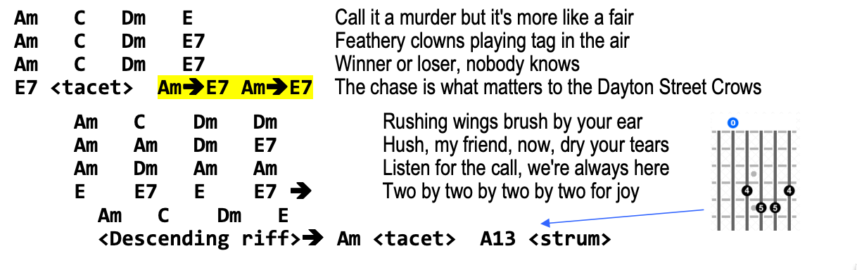
<Descending riff> -> Am <tacet> A13 <strum>To me, that means, play a descending bass riff which goes straight into an "A Minor" chord, then perform a tacet, then play a slow strum of an "A Minor/major thirteenth" chord. You might choose to use different words to describe these things, so use whatever makes the most sense to you.
In my case, the words that I use aren't even technically accurate. For example, the actual definition of "tacet" means to not play anything for a period of time, but I say "tacet" to indicate suddenly pressing my hand on the strings to silence the chord and briefly pause. Likewise, I use "strum" in a special way here, to indicate that I perform a slow single strum of the chord and let it ring out. I use these kinds of words here because I don't know any better words which are concise enough for my purposes. It's simpler to write "tacet" than "palm-mute", and I still don't know the perfect term for a slow single strum (both glissando and arpeggio mean something different to me).
I also use this for notes about the song's dynamics, such as putting <Quiet> above that section of chords. Sometimes I convert such notes into a floating textbox, which makes them stand out even more (I do this in a later step, when formatting in the word processor).
Another notation that I like, is a single angle bracket before the chord to indicate an anticipated rhythm, where I'm hitting the chord ahead of the downbeat:
G >C F >GTo me, that means that there's a special rhythmic jump, going into the second and fourth chords in that progression. It's hard to describe in words, but it makes sense in the context of the song. Those angle brackets, combined with my general familiarity with the song, allows me to play it correctly as I'm reading the chart.
For hard chord "stabs", I like to put an exclamation mark, like this:
E!Or a group of sudden fast stabs, I like to put them all down with no spaces between them:
EEEEE The clean style of the Monkey Chart layout will make these special notes stand out. If I do it carefully, I'm able to follow along with all the special notes as I play the piece. Beware, though, adding too many of these can make a chart unreadable. I keep these to a bare minimum, using them only where absolutely necessary. Most of the time, my familiarity with the song lets me play the nuances automatically without having to write them down at all.
Capo instructions, different tunings
If the song is meant to be played with a capo, I put that at the top of the chart, right after the title:
CAPO 2Then I write the rest of the chart in capo position. For example, a D-shape chord with capo 2 is actually playing an E, but the chart will still say D in that case, so that I don't have to transpose in my head as I read the chart.
I do the same thing for nonstandard tunings like DADGAD or Drop-D. Later, when I'm formatting the chart in the word processor, I sometimes add yellow highlighter to those notes, so that I don't forget to capo or retune during a performance (don't tell me you haven't done that before).
Sometimes I need to write more than one capo note at the top of the chart. For instance, one of our charts has this line, indicating the difference between the canonical studio recording, and our live performances. When playing it live, we change the key to make things easier on our string section:
LIVE: CAPO 2 (strings play in Em) STUDIO: CAPO 1Speaking of our string section, they don't have capos. So when I give a chart to them, or to any non-guitarists for that matter, I make a second chart, transposed into the actual key. Many songs in my songbook have two versions: The original capoed song, and a transposed copy with (Actual Key for Strings) added to the file name. I will either transpose the chart myself, or google for one of the web sites which can transpose charts. I always test the transposed chart, in case I made a mistake in the transposition.
Clean up the lyric lines
I remove all unnecessary punctuation from the lyric lines, especially periods at the ends of lines. We need the words, but not the punctuation, to sing the song. I'll leave in important punctuation if it's part of the performance, for instance, a comma in a certain spot might make the phrasing clearer. But I remove as much punctuation as I can while still keeping it readable. Mostly to save space: Adding too many characters in the lyric line can cause the line to extend past the right margin and make the line wrap around. This becomes important later, when the chart gets formatted in the word processor.
I remove double spaces and trailing spaces from the lyric lines for the same reason: to save space and prevent wrapping. Double spaces and multiple-spaces are needed in the chord sections, and in the gap between the chords and the lyrics, but I remove double spaces from the lyrics themselves. This also helps me to write macros to assist with formatting: When I prepare the charts, any text preceding 2 or more spaces will be chords, and any text after the last double-space will be lyrics. My macros search for the double spaces, and so they'll only work if I've stripped all the double spaces out of the lyric portion of each line.
I also edit as many capital letters out of the lyrics as I can, while still keeping it readable. Changing capital letters to lowercase can save a little bit of horizontal space. At this stage, while I'm still in the plain-text editor in a fixed-width font, a capital letter takes up the same amount of space as a lowercase letter, but this will change soon: The lyrics will be changed to a variable-width font when I move to the word processor for final formatting, and there the capital letters will be wider than the lowercase ones. I tend to make the first letter of each lyric line be a capital letter, and capitalize proper nouns, but uncapitalize most other letters. I often need to do this when I’ve copied lyrics from another source and changed the line breaks.
Test the chart while still in the text editor
I now have a first draft of the chart, in plain ASCII text. Before I move over to the word processor for formatting, I try out the chart. I try to play and sing the song from the screen a couple of times. Some of the choices I made earlier, when making this first draft, might need to change once I get the song under my fingers. I make edits as needed at this stage.
Formatting in the Word Processor
Once the chart works well in the text editor, I move to the word processor. Pretty much any word processor will do. On Windows, I use a very old version of MS Word, and on Macintosh, I'm currently getting by with Libre Office.
I can do all of these formatting steps by hand without any trouble. I've also programmed some macros to save me a little time. I don't make use of style sheets or paragraph styles, though they would probably save me even more time; that's something to experiment with in the future.
Letter size page
I start with a US-Letter size page, which is 8.5 by 11 inches. The A4 paper standard is about a quarter inch narrower than US-Letter, and about half an inch taller. My friends in foreign lands might find that songs don't fit quite as well on an A4 page: US-Letter's extra horizontal room allows slightly longer lyric lines, which is useful for every line in the song, whereas A4's extra height only helps with a few lines at the bottom. That particular quirk makes US-Letter especially well suited to the Monkey Chart format, but A4 is fine too.
Paste the text
I select-all and copy the song's text from the text editor, and paste it into the blank word processor document. It won't look pretty at first, but it will all be fixed soon.
Margins
I set the document margins as narrow as possible. The smaller the margins, the larger the text can be, and thus more readable. Most word processors default to a wastefully huge margin, which is a throwback to olden days when early laser printers had huge unprintable margin areas. Most modern printers have very small margins. A quarter inch is often cited as a good safe margin size, but some printers can print down to an eighth inch margin or smaller.
- I remove all headers and footers, since I'm not using that feature and they take up precious space.
- Since I usually display my charts on a tablet computer, I could theoretically get away with setting all my margins to zero. But at gigs, I also bring a printed backup copy of the set, in case my tablet malfunctions. So I need to compromise on margins.
- I set my right/outer margin to zero. This gives as much room as possible for the lyric lines to fit without wrapping. On the printed backup, it's OK if the last couple of characters of the lyric line get cut off by the printer's nonprintable area on the right margin.
- I set my top and bottom margins to 0.09". This allows more lines of the song to fit on one page, but leaves a tiny bit of margin at the top and the bottom of the page. With such a small margin, the last line of the song isn't cut off completely and the title of the song is readable.
- Since my printed backup charts go in a three-ring binder, I set my left/inner margins to 0.5" to allow space for the hole punches, and to ensure that no chords get cut off. Sometimes I can get away with an inner margin that's a little smaller, because the holes often miss the chords on the left, but I have to check to ensure I haven't hole-punched a chord out of existence.
Fonts for lyric sections
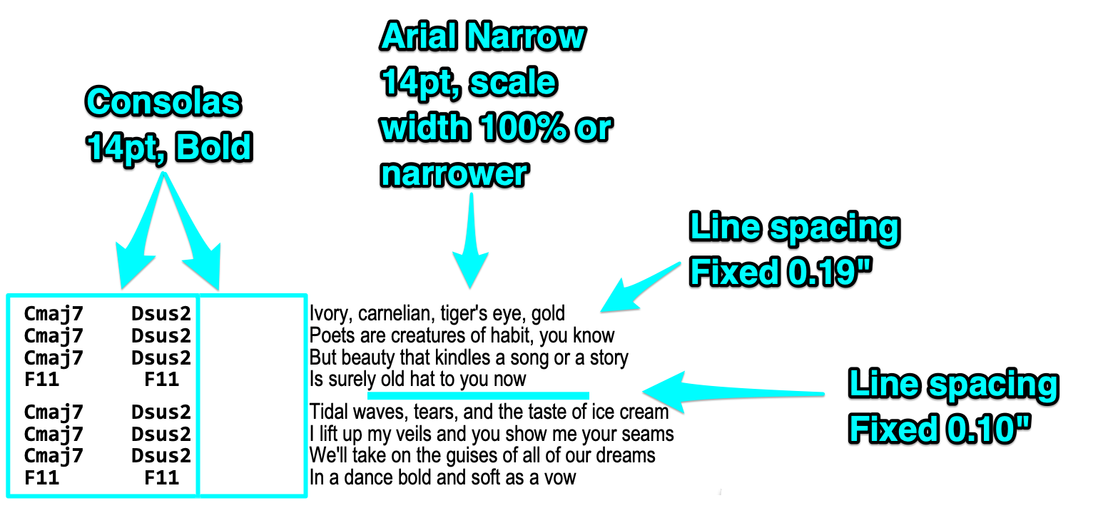
I set the lyric font before setting other fonts. I select all, then apply the font to the whole chart.
- I use a variable-width narrow font for the lyrics, without bold or italics. A narrow font for the lyrics saves precious space on the line, helping it fit within the margins.
- I use Arial Narrow, but any narrow, easily readable font works fine. I use a sans-serif font for the same reasons that they use sans-serif fonts on road signs.
- I start with the font's "scale width" at 100%, but I know that I can make the font narrower if I need to later.
- The narrower the font, the harder it is to read, so this is a balancing act. Fortunately, neither I, nor my lead singer, require every word to be perfectly legible. Most of the time, we only need a glance at the lyrics on the chart to give us reminders, such as at the beginning of a verse.
- I start with the lyrics at about 14 points size, and adjust from there.
Selecting the chords separately
In my word processors, I can select text in columns rather than lines by holding the ALT key while drag-selecting the text. This makes it much easier to apply a different font to the chord sections all at once, it's a great timesaver.
Note that this isn't the same thing as using the actual columns feature of the word processor. I don't use the columns feature because that would cause the lyrics and the chords to become desynchronized whenever the document got changed.
I can also use my macros here, taking advantage of the fact that the chords are separated from the lyrics by at least two spaces, and the lyrics have been stripped of double spaces. This allows my macros to select everything between the start of the line and the last double space, and apply font changes to those selected characters.
Fonts for chord sections
I select the chords and apply a monospaced font, in bold, to the chords and all of the spaces between the chords.
- I also use the same monospaced font for the gap between the chords and the lyrics to keep everything perfectly aligned.
- I recommend the monospaced font Consolas for the chords. The font comes with Windows and MS Office, and I also copy this font onto my Mac. I find that there are certain letterforms which are more distinguishable from each other in this font, than, say, in Courier. For example, it's important to be able to tell G from C at a glance.
- I set the chord font to the same size as the lyric font, with a "scale width" of 100%.
Fonts for the title
The first line of the document (song title and author) stays at normal size, and all on a single line. I try not to waste precious space on enlarging the title and author, since I'm not reading those while I'm playing the song.
- I leave the title at the same size as the lyric text, and make it bold. The exact font is unimportant, I just pick something nice which differs from the lyric text.
- Then I make the “by (author name)” portion non-bold and slightly smaller.
Tweaking font size
With the lyric and chord fonts applied, I adjust the overall font size. My goal is to make the text readable, and have the chart fit on the page horizontally.
- I try to make my charts least 14-point, bigger if I can manage it without making the lyrics wrap. Anything smaller than 14 point is hard to read during a performance. 16-point or larger is optimal, if possible.
- I keep changing the font size as I'm doing other edits, trying to strike the balance between the largest possible font size, and having it correctly fit on the page horizontally without wrapping.
Fixing line wraps
I check to make sure no lyric lines wrap past the right margin. No lyrics are allowed on the left side of the page, only chords.
Note that I'm not worrying about the length of the document or the number of pages just yet. I'll worry about the vertical spacing in a moment. First, I need to make sure the song fits the page width-wise.
If I have trouble fitting a particular lyric line onto the page without wrapping, there are a few ways I can correct it:
- I could reduce the overall font size.
- I could reduce the size of the indentations by deleting some of the spaces in front of the chords, or between the chords and the lyrics. Sometimes the difference between fitting and not fitting is just a couple of characters.
- I could strategically edit the troublesome lines, splitting the chords and lyrics into two lines. This will free up space in the right margin, but it might stretch the length to two pages.
- I could edit the "scale width" of the lyric font to be even narrower than its default width. Most word processors can change the width of the font in percentages. For some charts, I’ve had to reduce the lyric font’s scale width to 90% or less to fit within the margins.
Line and paragraph spacing
Now that I've got the width taken care of, I can start to look at the document's length. This can be optimized by reducing the distance between paragraphs and/or lines, because word processors usually default to a very wasteful amount of line spacing.
- In a Monkey Chart, each line of the song is its own paragraph, so I set the line and paragraph spacing to be either "single" or "fixed", and reduce the line height. The goal is to fit more lines of text per page, without reducing the font size.
- I set the line and paragraph spacing of the entire chart, adjusting it a little bit at a time and looking at the document. I check for the tradeoff between readability and fitting the song onto one page.
- I separately select the blank lines between the song sections, and set their font size and line spacing to be smaller than the rest of the document. I set those to be about half the size of the other lines.
- Alternatively, I could make each song section a paragraph: using Shift+Enter for line breaks and a regular Enter for new sections, and then adjust paragraph spacing for visual separation. This would be more in keeping with the way word processors were intended to work, but I personally prefer to treat every line as its own paragraph, and manage the inter-section gaps manually. This gives me the most control over spacing.
Finalize the font size and number of pages
Sometimes I end up with a song where, no matter what I do, I can't make it fit onto a single page readably. I take advantage of this opportunity to reformat the song so that the font is larger, and the line spacing is more relaxed. Though a two-page chart is less convenient, it lets you make it more readable.
- On two-page songs, I carefully choose the best place to insert the page break between the two pages. Since I'm usually displaying my charts on a tablet computer, I find a spot near the middle of the song where it's going to be easiest for me to press my page-turner pedal without messing up the performance.
Convert ASCII arrows to arrow symbols
If there are any places the chart where I used ASCII imitations of an arrow, like:
F->G->CI replace those ASCII arrows with fancy-looking arrow characters. I adjust the arrows' character scale width so that they fit in the same amount of space that the two original ASCII characters occupied. That way, the columns in the document will all still line up.
I use a heavy arrow from the Wingdings font, and set its character scale width to 102%. This makes that particular arrow character take up the same amount of space as two Consolas characters.
Add yellow highlighter where needed
I use the word processor's "yellow highlighter pen" feature to highlight certain parts of the chart, which is possible because I always print or display the charts in color. I do this sparingly and only highlight the most important stuff that I might otherwise miss. The basic design of the Monkey Chart is clean enough that I'll notice the important stuff naturally, leaving very little need for highlighting. Here are some things that I sometimes highlight:
- Capo or tuning instructions at the top of the page.
- Chords which subvert a previously-established pattern in the song. For instance, if the chords change slightly during the last verse or the last chorus of a song.
- Areas of the song where a passage is repeated a different number of times than usual. For example, if the last chorus of the song repeats the hook line more times than the other choruses.
- Lyrics which I frequently forget during a performance. Usually I only need to highlight the first couple of words of the line. I could also make those words bold if I wanted.
- Lyrics which are sung by different members of the band, such as the tradeoffs in a duet, or sections with harmony vocals.
Chord Diagrams
Most of my charts use common chord names that don’t need diagrams. But if a song throws in a few curveballs, I’ll diagram the tricky ones.
I don't read the chord diagrams during a performance, but I quickly review any unusual chords and test their fingerings before starting the song. The diagrams don't need to be large, just big enough to stand out, big enough to decipher during the inter-song gap before the first downbeat, and positioned where I'll notice them. Here are some different ways I have added chord diagrams to my charts:
Definitions at the top with quick fret numbers
This is the easiest option to implement, where I simply list the fret numbers for each string. For instance, a chart might have a line like this at the top:
F11 (Fmaj7#11) 133200 That means, when I see the "F11" chord later in the chart, I know it really means an Fmaj7#11 chord, which is the E string fret 1, the A and D strings fret 3, the G string fret 2, and the B and high E strings open.
This kind of formatting works, but it forces me to spend extra time deciphering the chart during that inter-song gap.
A diagram section
The fancy option is to fully diagram the unusual chords in a special section. I create a bordered floating text box in the word processor, and place it where there's some room, such as the upper right corner or along the bottom edge. In most word processors, the text will wrap awkwardly around the box until I change its settings to “floating,” with text set to print “through” or “behind”. The exact settings vary by program. Then I reposition and resize the box so it doesn’t cover any text in the chart.

In the floating box, I paste actual chord diagrams and type the chord names above them. I like to screenshot the chord diagrams from "reverse chord finder" websites (there are several such sites available). I punch in the finger dots on the web site's interactive diagram, and once it looks right, I do a "crosshair screenshot" with a screen-capturing tool (I use Skitch on the Mac). I copy/paste that into the text box in the word processor, and reposition and resize it. In some word processors, I have to paste the image outside of the box, set the pasted image to "floating" with text "through" or "behind", and then reposition it over the text box. Then I type the desired chord names into the box above the picture.
Inline where needed
If only a couple chords are problematic, I paste their diagrams next to the chord names where they appear in the chart. Again, I usually need to set the pasted image to "floating" with text "through" or "behind", to keep it from wrapping the text weird and ruining the document layout. Once the diagram is in place, I may tweak the layout to make room for it, or position it off to the side with an arrow pointing to the corresponding chord.
Final Tweaks
Special note boxes
I sometimes use floating text boxes for special notes in the song. For instance, if I've made a dynamics note in the chords, I could convert that into a small floating text box. As always, I have to set the box properties to "floating" with text "through" or "behind" to make these boxes work correctly. I can use these little boxes for any kind of note I want, such as reminding myself that my tempo tends to falter on the choruses of Trouble:
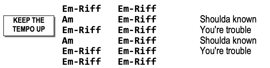
These notes stand out well on the chart, as long as I only use them sparingly. Too many boxes like this, and the chart becomes very cluttered. It's like the boy who cried wolf: If the entire song is covered with special cases, then I accidentally start ignoring the special cases.
Tablature for riffs
A Monkey Chart is a completely different thing than tablature or sheet music. I can't read tabs fast enough to perform them live. However, for some songs, I still might need to note the details of one or two small riffs.
Just like the chord diagrams, I don't decipher them while I'm playing. I quietly review them in the inter-song gap before I start playing the song. I give them a name and then use that name in the chart:
I haven't got a really good way to make the tablature, so I don't do it often. Currently I'm doing it with monospaced ASCII hyphens, vertical bars and numbers. I reduce the font size, line spacing, and character spacing, until the characters touch each other. This isn't very readable, though it does the job in a relatively compact space. Perhaps I should try using screen shots from tablature-creation web sites, like I do for the chord diagrams.
Horizontal lines
Strategically adding a couple of horizontal lines to the chart can help me keep my place in songs where I still get lost sometimes. I've found that sticking a couple of horizontal ruler lines in the chart, at the problem spots, helps me keep my position. This is rarely needed; I can only think of two or three songs where I've had to do this.
To make a horizontal line, I can either use the line drawing features of the word processor, or it also works to just add an underline to all of the text on that line, including the spaces.
Offsetting columns
Occasionally, having the chords in neat columns is a hindrance. Sometimes a chord progression will be very samey but with one tiny change at a certain point. My eye might miss the small change. For those situations, I will sometimes tweak the column spacing to offset the differing chord to make it stand out:
G  G  C  G
G  G  C  G
G  G   G  C
G  G  C  G
Finishing Up
Practice the final chart
With the chart finished, I run through the song a couple more times with it. Based on how well I do, I might go back and make additional edits.
Update the chart, keep copies in sync
I'm continually updating my charts as time goes on. Sometimes I don't notice there's a problem with the chart until I've used it at a few gigs, so I just make the necessary tweaks once I've figured out what needs to be changed.
Whenever I've hand-scrawled notes/corrections onto a chart (either virtually on the tablet, or in real life on a paper copy), I always make sure to go back to my original document, and edit those changes into the chart properly, as soon as I get a chance.
I store my charts on a file sharing service which my computers, phones, and tablets all synchronize with. I'm able to use a free account on the file-sharing service, because these chart files are relatively small, and I synch only my songbook folder.
Export to PDF
Though I always keep my charts in their original document format for editing, I also export a PDF version of each completed chart. I keep the PDF alongside the original document in the same folder, and I make sure to re-export the PDF if I make any edits. The PDF is useful for a few reasons:
- PDFs are needed for any tablet software that displays music charts. I've tweaked these charts to their limits, so if I try to display the raw document files in music chart programs, they likely won't format correctly. Usually the problem is that the lyric lines start wrapping again, often caused by something like a missing font, a failure to recognize font scale width, a failure to obey the margin setting, etc. Though these programs are improving how they display raw documents, they're still not perfect. PDFs are better because they're always guaranteed to display correctly.
- When someone else needs a copy of the chart, I send the PDF to them for the same reason: It ensures that the formatting stays the same and that they don't get weird line wraps or missing fonts, either when printing or displaying.
- For band members who need to make their own edited version of the chart, I'll send them both the editable document file, and the PDF version. That way, they can edit the document, and can also look at the PDF to see what my intended formatting was supposed to look like.
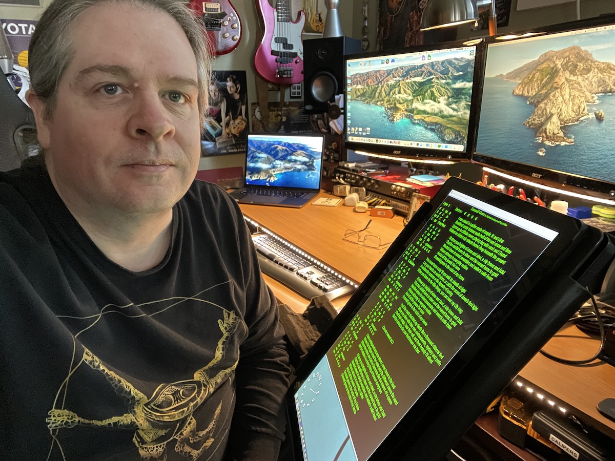
Display as a negative image
I use a tablet computer to display my charts while I'm on stage, and I use a page-turner pedal to step through my set list. Many other musicians do the same thing. It's convenient, but it often causes an interesting problem.
When my lead singer and I are standing on the stage facing the tablet, the glow from the tablet screen illuminates our faces from below, in a cold blueish light. I think this is unattractive, and it draws unnecessary attention to the tablet. We look like we're trying to tell a scary story at summer camp. I notice this same thing happening for other tablet-using performers, too.
The stark white document background is what's responsible for the glow, so my solution is to display the charts in negative colors. This changes the background to black, with only the text lit, reducing the amount of glow from the screen, significantly reducing the problem.
I actually go an extra step further, and make sure the text is displaying in green pixels instead of white pixels (like an old CRT) causing the glow on our faces to be almost eliminated.
 |
 |
|---|
There are a few ways to accomplish this:
- Some of the software programs which display charts have a "night mode" feature built in already.
- For the software programs which don't have that feature, tablet computer operating systems have Accessibility settings for this, such as high contrast or negative image. Though this makes everything on the screen look weird, it can be easily deactivated after finishing the set. I can't get green-on-black with an Accessibility setting, but I can get white-on-black, which is often good enough.
- Making a green-on-black version of each chart could also work.
- Making a magenta-on-white version of each chart, and then displaying in negative image mode, results in green-on-black, too.
- To avoid all of the above, I wrote my own software to display my charts. The software is super janky, but it does the green-on-black trick perfectly. (It's actually just a sloppily-written Microsoft Word 2003 VBA macro.)
The black background has a side benefit of making the chart a little easier on the eyes. I find that I can read the charts better at a distance in this mode.
Report Back
Tell me about how the Monkey Chart works for you! And spread the word! Link people to this page! Proselytize the awesome benefits of this format! Do you know of anyone else using this style of chart, perhaps someone who came up with it independently? Hit me up! https://www.vixyandtony.com/contact.html